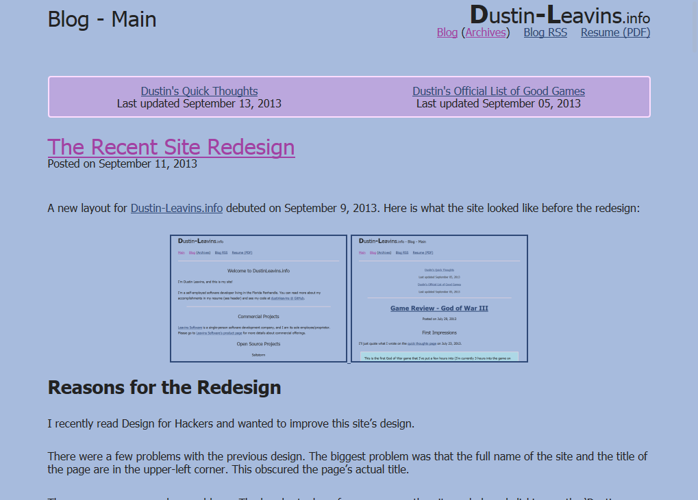
The Recent Site Redesign
Posted on | Updated
A new layout for Dustin-Leavins.info debuted on September 9, 2013. Here is what the site looked like before the redesign:
Reasons for the Redesign
I recently read Design for Hackers and wanted to improve this site’s design.
There were a few problems with the previous design. The biggest problem was that the full name of the site and the title of the page are in the upper-left corner. This obscured the page’s actual title.
There were some secondary problems. The header took up far more space than it needed, and clicking on the ‘Dustin-Leavins.info’ logo did not take you to the main page (or anywhere at all). Block quotes had a light-blue background, making quoted text slightly hard to read.
The Redesign
Here’s what the redesign looks like on desktops:
I’m happy with this design. The header is relatively small. The site’s name and navigation are now at the right side of the screen, letting the page title dominate the left side. The redesign allows for more content to be on-screen.
Mobile Woe
The September 9th version of the site had a problem: the header looked terrible on some mobile devices.
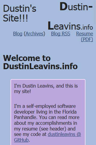
This is how the ‘September 9th’ version looked when viewed at 320x480. This happened because I designed for desktops first and did not bother testing the site at mobile & tablet resolutions.
I saw what the site looked like at low resolutions, and I knew that I had to introduce width-specific design tweaks. After changing the CSS to use Bourbon Neat, I ended-up with this:

The mobile tweaks introduced another problem: the text that should read ‘Resume (PDF)’ appears to be cut-off. I have not figured out a fix for this that doesn’t involve style hacks, so I have learned to live with it for now.
Conclusions
Adapting the redesign to look alright on mobile devices was a bit harder than it should have been. Developing desktop-first seriously hindered my ability to see what changes needed to be made for mobile users. In the future, I might take a mobile-first approach.
On the other hand, the redesigned site would have looked far different (and perhaps closer to the original version) if I went mobile-first. The redesign’s mobile header and the old version’s header look similar. The major difference between the two is that the redesign’s site title and page title are on two lines instead of one. Had I developed mobile-first, the desktop version’s header might not have columns like it currently does (and would only be a minor improvement over the pre-redesign version’s header.)
Even though the approach I took wasn’t “mobile friendly” in the slightest, I like the results. But next time, I’ll be sure to check what the site looks like on mobile before pushing it to production.
Updates: 2013-09-16 Replaced non-present screenshot that shows new blog layout